In my last post I wrote about the challenges faced by undergraduate students in introductory historical geology. They are required to know an overwhelming breadth and depth of information about the history of the Earth, from 4.5 billion years ago to present. They must learn not only what events occurred, but also the name of the interval of the Geological Time Scale in which they occurred. This is a very difficult task! The Geological Time Scale itself is a challenge to memorize, and the events that fit on it often involve processes, locations, and organisms that students have never heard of. If you want to see a case of cognitive overload, just talk to a historical geology student.
My proposed solution was a scalable timeline. A regular old timeline is helpful for organizing events in chronological order, and it could be modified to include the divisions of the Geological Time Scale. However, a regular old timeline is simply not up to the task of displaying the relevant timescales of geological events, which vary over at least six orders of magnitude. It is also not up to the job of displaying the sheer number of events that students must know about. A scalable timeline would solve those problems by allowing students to zoom in and out to view different timescales, and by changing which events are shown depending on the scale. It would work just like Google Maps, where the type and amount of geographic information that is displayed depends on the map scale.
Doesn’t that exist already?
My first round of Google searches didn’t turn anything up, but more recently round two hit paydirt… sort of. Timeglider is a tool for making “zoomable” timelines, and allows the user to imbed media. It also has the catch phrase “It’s like Google Maps but for time,” which made me wonder if my last post was re-inventing the wheel.
ChronoZoom was designed with Big History in mind, which is consistent with the range of timescales that I would need. I experimented with this tool a little, and discovered that users can build timelines by adding exhibits, which appear as nodes on the timeline. Users can zoom in on an exhibit and access images, videos, etc.
If I had to choose, I’d use ChronoZoom because it’s free, and because students could create their own timelines and incorporate timelines or exhibits that I’ve made. Both Timeglider and ChronoZoom would help students organize information, and ChronoZoom already has a Geological Time Scale, but there are still features missing. One of those features is adaptive formative assessments that are responsive to students’ choices about what is important to learn.
Learning goals
There is a larger narrative in geological history, involving intricate feedbacks and cause-and-effect relationships, but very little of that richness is apparent until students have done a lot of memorization. My timeline tool would assist students in the following learning goals:
- Memorize the Geological Time Scale and the dates of key event boundaries.
- Memorize key events in Earth history.
- Place individual geological events in the larger context of Earth history.
These learning goals fit right at the bottom of Bloom’s Taxonomy, but that doesn’t mean they aren’t important to accomplish. Students can’t move on to understanding why things happened without first having a good feeling for the events that took place. It’s like taking a photo with the lens cap on- you just don’t get the picture.
And why assessments?
This tool is intended to help students organize and visualize the information they must remember, but they still have to practice remembering it in order for it to stick. Formative assessments would give students that practice, and students could use the feedback from those assessments to gauge their knowledge and direct their study to the greatest advantage.
How it would work
The assessments would address events on a timeline that the students construct for themselves (My Timeline) by selecting from many hundreds of events on a Master Timeline. The figure below is a mock-up of what My Timeline would look like when the scale is limited to a relatively narrow 140 million year window. When students select events, related resources (videos, images, etc.) would also become accessible through My Timeline.
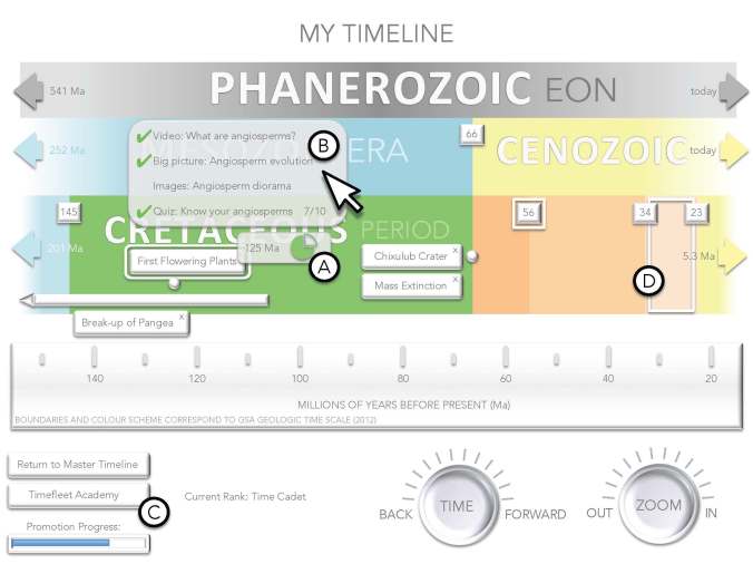
A mock-up of My Timeline. A and B are pop-up windows designed to show students which resources they have used. C is access to practice exercises, and D is how the tool would show students where they need more work.
Students would benefit from two kinds of assessments:
Completion checklists and charts
The problem with having abundant resources is keeping track of which ones you’ve already looked at. Checklists and charts would show students which resources they have used. A mouse-over of a particular event would pop up a small window (A in the image above) with the date (or range of dates) of the event and a pie chart with sections representing the number of resources that are available for that event. A mouse-over on the pie chart would pop up a hyperlinked list of those resources (B). Students would choose whether to check off a particular resource once they are satisfied that they have what they need from it, or perhaps flag it if they find it especially helpful. If a resource is relevant for more than one event, and shows up on multiple checklists, then checks and flags would appear for all instances.
Drag-and-drop exercises
Some of my students construct elaborate sets of flashcards so they can arrange events or geological time intervals spatially. Why not save them the trouble of making flashcards?
Students could opt to practice remembering by visiting the Timefleet Academy (C). They would do exercises such as:
- Dragging coloured blocks labeled with Geological Time Scale divisions to put them in the right order
- Dragging events to either put them in the correct chronological order (lower difficulty) or to position them in the correct location on the timeline (higher difficulty)
- Dragging dates from a bank of options onto the Geological Time Scale or onto specific events (very difficult)
Upon completion of each of the drag-and-drop exercise, students would see which parts of their responses were correct. Problem areas (for example, a geological time period in the wrong order) would be marked on My Timeline with a white outline (D) so students could review those events in the appropriate context. White outlines could be cleared directly by the student, or else by successfully completing Timefleet Academy exercises with those components.
Drag-and-drop exercises would include some randomly selected content, as well as items that the student has had difficulty with in the past. The difficulty of the exercises could be scaled to respond to increasing skill, either by varying the type of drag-and-drop task, or by placing time limits on the exercise. Because a student could become very familiar with one stretch of geologic time without knowing others very well, the tool would have to detect a change in skill level and respond accordingly.
A bit of motivation
Students would earn points for doing Timefleet Academy exercises. To reward persistence, they would earn points for completing the exercises, in addition to points for correct responses. Points would accumulate toward a progression through Timefleet Academy ranks, beginning with Time Cadet, and culminating in Time Overlord (and who wouldn’t want to be a Time Overlord?). Progressive ranks could be illustrated with an avatar that changes appearance, or a badging system. As much as I’d like to show you some avatars and badges, I am flat out of creativity, so I will leave it to your imagination for now.